School has started, and you have a million things to share on your social media channels. But have you taken time to look at your cover photo lately?
Does it still show the 2016 graduates?
Is it a boring old picture of your school building (not so boring if it is new, but pretty boring if it is more than six months old).
The cover photo of your Facebook, Twitter, and YouTube channels is prime real estate when it comes to branding your school and telling your story. Here are my tips when it comes to your cover photos:
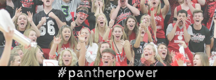
- Change out your cover photo at least once per quarter. You should match it with the seasons. Showing kids in winter gear during summer months doesn’t seem relevant enough to the constant updates social media provides. It’s football season now, which is why I LOVE this photo from Wilmot Union High School.
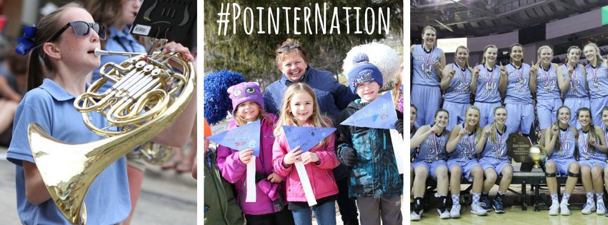
- Represent a variety of ages, gender, and activities on your cover photo. If you use just one image on the cover photo, then you should think about changing it out a few times a month. This collage from Calvin Christian School in Minnesota does a great job of sharing kids of all ages from its three different campuses.
- Consider promoting your school hashtag on the photo. This Facebook cover image from Hayward Community School District incorporates the hashtag, mission statement (ACHIEVE), and even cross-promotes other social media channels. If this is too busy for your taste, you can consider going more basic like the collage on Mineral Point Unified School District. If you are looking for an easy way to add words to your photos, check out my blog on seven easy apps to create your own photo graphics.
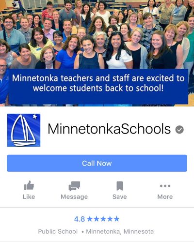
- Remember that the cover photo looks different on your desktop than on your mobile devices. Well over half of your viewers are looking at your page from their phone, so keep that in mind! The official size of your Facebook cover image is 851 X 315 pixels. If you upload an image larger than this, you’ll get a variety of cropping done from various devices. Minnetonka Public Schools gets it right with this cover image.
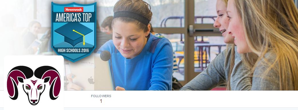
- If you have a special award that you’d like to promote, consider adding it to your cover image. Check out this one from Big Horn, WY. #SocialSchool4EDU is just gearing up to launch their social media channels, so that is why you won’t see many followers yet!
- Your cover photo can actually be a call to action! Check out this image from the School District of LaCrosse. I’m assuming that they will be changing this out soon, since school has now started, but it was a great illustration to use. When you click on the image, you get more details: “For more information on how to enroll your child in the School District of La Crosse for the 2016/17 school year click this link: https://www.lacrosseschools.org/overview/enrollment/.” To add this extra step, you simply click on the photo once you’ve uploaded it as your cover photo and then add a description to the photo.

As you create cover updates for each profile (Facebook, Twitter, and YouTube), you’ll need to alter the size slightly. I urge you to stay consistent across platforms, so as you update your Facebook cover photo, update the image on other channels too. It just makes your job a bit easier than trying to track different cover image ideas for each.
If this article nudged you enough to take action, let me see your creative efforts! Feel free to post it down below. And if you never want to miss a helpful article on social media for schools, make sure to sign up here. You’ll get a helpful sheet of 100 ideas for social media posts just for signing up!

