It’s a new school year, which makes for a fresh opportunity to tell your school’s story.
And guess what? Branding your social media channels matters! I can tell with just a glance at your Facebook or Twitter page whether you are an amateur or a pro when it comes to branding.
So where do you stand? Check out these three basics to find out!
- Your profile image is your logo
And I’m not talking a pixelated logo that doesn’t really fit in the circle… Your school’s profile image is important! It should be an image with very limited additional words. You may have several versions of your logo, but this version should be the most simplified form. Taglines and repetition of the name of your school in small print is IMPOSSIBLE to read on your social media channels.
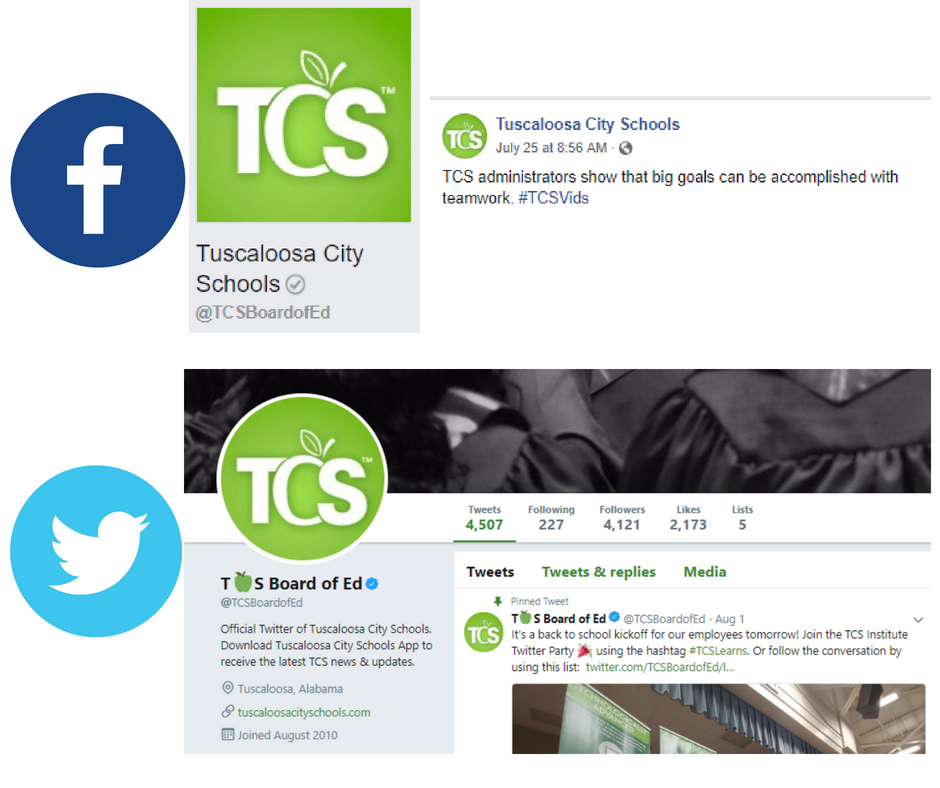
Check out the Tuscaloosa City Schools logo below. It’s clean, consistent, looks great in the square or circle, and they aren’t trying to spell out the entire name of the district. The name on the district’s account will always be next to the profile image when you post, so that is important to remember!
I don’t want to be mean and put bad examples of school profile images, but many schools have been there at some point. It may be time to focus on a new logo. Take a look right now at your pages.
All social media channels should have the same version of your logo, and all should fit nicely in the box or circle provided. A square image, meaning equal height and width, is needed to accomplish this task. For example, the logo for South St. Paul below is 1200 X 1200 pixels.
- Your Facebook & Twitter cover photos are updated & attention-grabbing
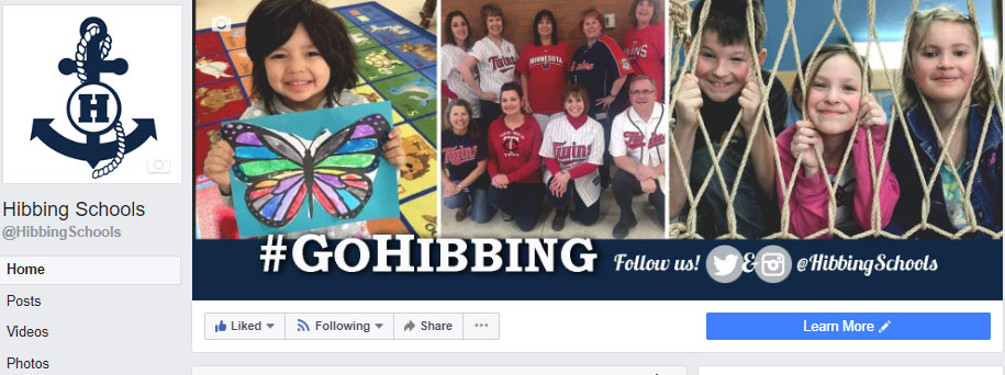
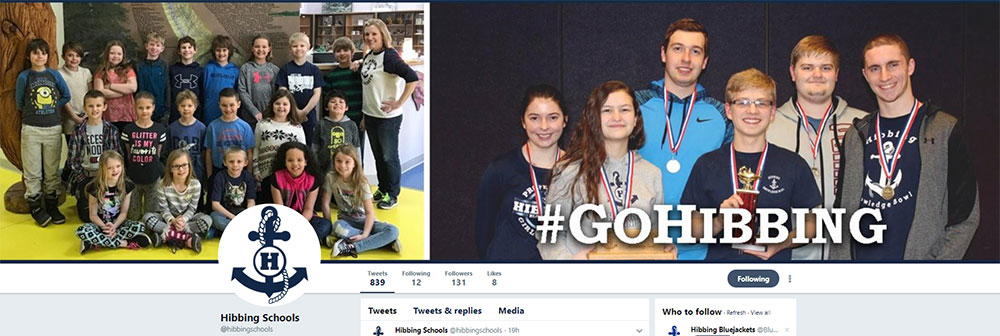
If your cover image is a photo from 2014, it’s time to for an update! Your Facebook and Twitter cover images are important real estate when it comes to showcasing your school. And I’m NOT talking about a photo of your building.
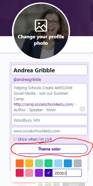
And lately, I have seen so many schools with no Twitter cover image. That’s a big error! Here is a quick note on Twitter: utilize the customized theme color for your Twitter page. When you go to edit your profile and update your cover image, you can select a theme color.
A few quick tips:
- Make sure your photos are high resolution
- Do NOT use a stock photo. You need photos of YOUR students and staff.
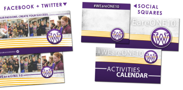
- Consider branding a collage with your colors, hashtags, and other information
- Make sure you create your cover images the right size. I recommend creating your FB cover as 960 X 540 so that it fits well on mobile. But please note that on your desktop, the top and bottom will be cut off. For more on this, check out this short #TipTuesday video.
- If you have a call to action with your cover image, remember that you can include a post on the image. Check out Tuscaloosa’s image to drive parents to find out more about the Chromebook orientation.
- Facebook now allows for videos to be used as a cover image. Here is a helpful blog that explains the details (length, size, and more) for Facebook cover videos.
- You use branded graphics for special announcements
Every post on social media needs an image.
No excuses.
So to make sure you always have an image to use, you should create some branded templates that can be used in a variety of ways. We create a Facebook blank graphic, and then also a Twitter/link graphic.
Facebook Blank Graphic – 940 X 788

Facebook Link or Twitter Graphic – 1200 X 627

You can also use other types of graphics, but make sure that they are free to use and are in high-resolution format. Bad clipart on your channels really impacts the look and feel of your brand.
Here are some various examples of how we use those generic images from above. If you have access to the blank graphics at all times on your phone (either save it to your camera roll or have it on Google Drive), there are many free or low-cost apps where you can add text to these images. My favorites are PicCollage and Word Swag.
Some versions that could be really helpful to make ahead of time include:
- Announcement
- FYI
- Parent Teacher Conferences
- Weather Update
- News
- Don’t Forget
- Athletic Update
- Thank You!
- Congratulations
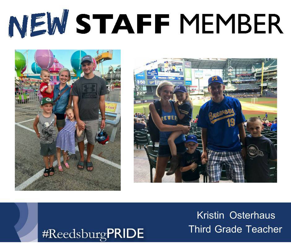
To really set your page apart, you can create some nice features that also emphasize your branding. Check out these examples of staff features, new staff introductions, job postings and motivational posts.
There you have it! Three branding basics for your school’s social media presence.
Now is the time to take action to ensure you are doing all of these things. There are free tools out there to make all of these things happen, but did you know that the team at #SocialSchool4EDU can help you out? We have an awesome (and affordable) graphics package to take your social media to the next level.
The social media package (option 2 at this link) includes a Facebook cover image, a Twitter cover image, and 3 other customized social squares. And guess what? We update your Facebook and Twitter cover images throughout the year to keep them looking fresh and in-season. You’ll get three additional updates after the initial design!
Contact me today if you’re interested – simply email me at andrea@socialschool4edu.com. Or if you want more information, visit my website.

