When you think of the word “graphics,” what happens?
Do you cringe?
Start hyperventilating and want to hide in a dark closet?
Or do you get a spark of happiness knowing that your creative side will get to come out today?
If the latter happens to you, congratulations, you’re one of the few, the proud, the creatively inclined! If your blood pressure rises, don’t panic; we have your back. This blog is full of helpful tips and tricks to get your graphics on the right track and keep you out of that dark closet.
Here are 5 common problems that hurt your graphics and some quick and simple solutions.
Problem 1: Using Google Images Clipart
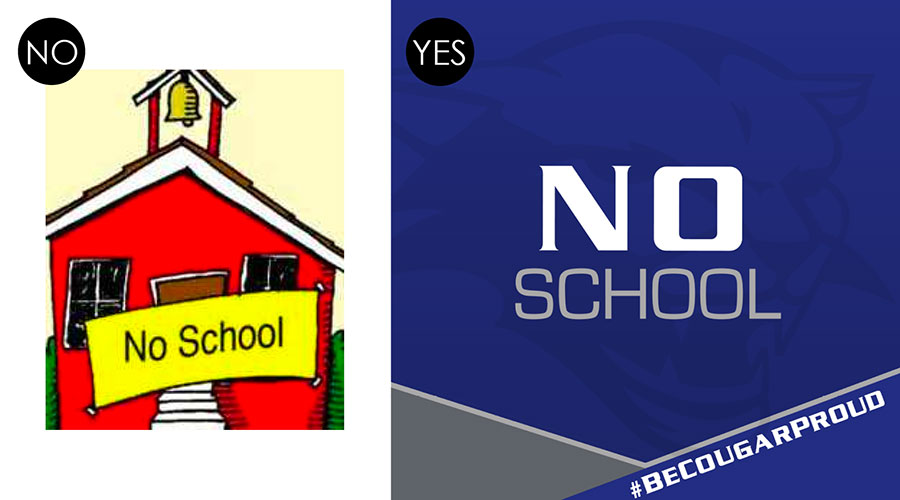
Isn’t it amazing how you can type anything into a Google search and, BOOM, it’s at your fingertips? Sounds dreamy, right? Here’s the problem… the results are usually copyrighted, low quality, or too small to use effectively on social media.
Solution: Make your own graphics! Apps like Canva, Pic Collage and WordSwag allow you to utilize photos, add custom color backgrounds or add your logo to make the perfect graphic. Just download your creation to your smartphone or PC and easily attach it to your social media post.
Problem 2: Overlaying Text On a Busy Photo
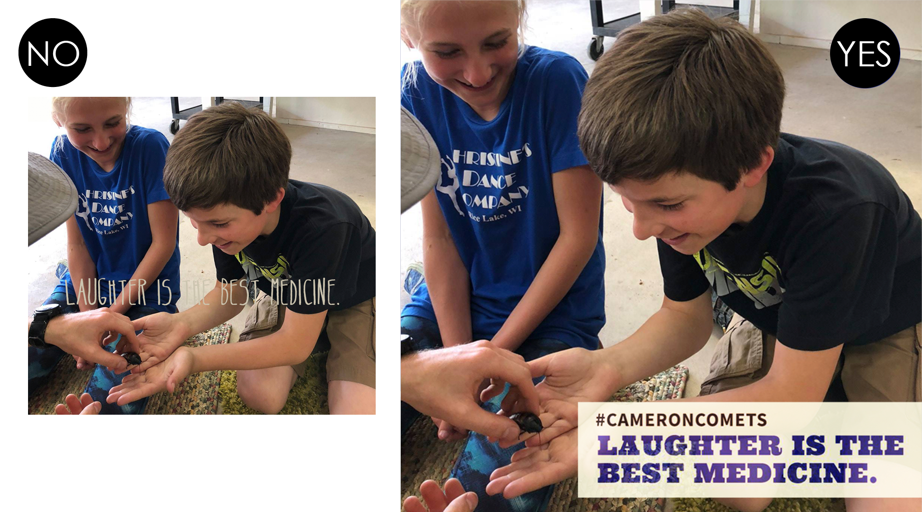
Adding text over the top of a photo can be tricky if this photo is busy or has high contrast. If the text color doesn’t pop, it’s likely that it’ll be hard to read on a screen.
Solution: Place text over a “dead area” in the photo using a contrasting color or place a solid or semi-transparent box behind the text in a contrasting color over the photo. Another way to remedy this is to use a filter on your photo that minimizes contrast and make sure your text overlay is done in a contrasting color.
Problem 3: Using a Photo of Your Building as a Cover Photo
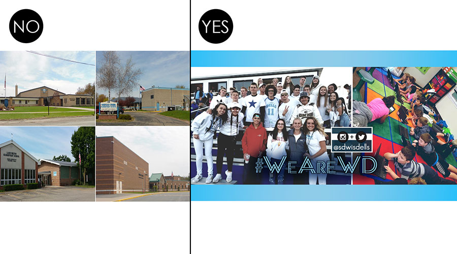
“Nothing stirs emotion in me like an aerial view of a giant brick building,” said no one ever! Buildings can’t smile, laugh or convey a sense of community; therefore, they’re not what you want to use as the face of your social media pages.
Solution: Always use photos of students and staff on your cover photo. Keep inclusiveness in mind when selecting your photos. Use photos that show your school’s range in age, race, and status. Photos that make you smile are always the best choice!
Problem 4: Using Too Much Information On Your Graphic

Do you ever see a poster that has SO MUCH INFORMATION on it that you have to look away? This same thing applies to social media but even more so. People scroll through their feeds quickly, and if your graphic is chock-full of information, it will make their eyes roll back in their heads and possibly cause a blackout. That’s an exaggeration, but they probably won’t click on it for more information- that’s for sure!
Solution: Keep it simple. When making a graphic for an event only add a few eye-catching words and leave the details for the description. See? Simple.
Problem 5: Inconsistent Branding
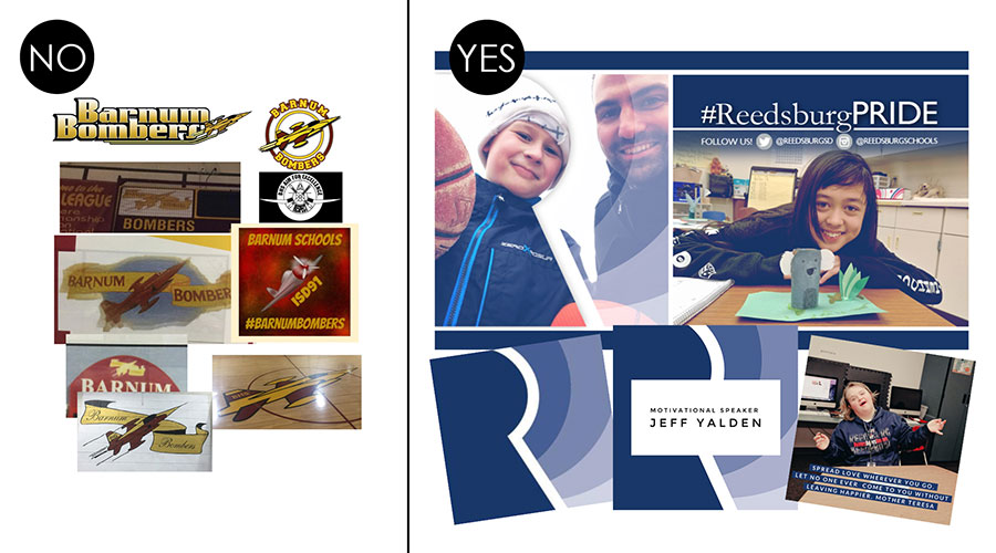
This problem is probably the most common of all. Many schools have endless logo variations that have popped up through the years, and no one knows who made them or which one is “the right one.” And do you know how many shades of blue there are? Just saying “blue and yellow” doesn’t cut it. Get to know your district’s hex color codes and use them consistently on graphics.
Solution: Get your branding on track! Figure out which logo is the correct one, or better yet, have us design you a brand new one! Using consistent fonts, colors, logos and graphics creates recognition, and in turn, recognition creates a sense of community for your followers. Consistent branding will, well, brand your district into your follower’s minds.
Hopefully, this blog will help improve the visual impact of your graphics, but if you’re still heading for that dark closet, consider letting #SocialSchool4EDU do the work for you! Our professional graphic designer (yours truly) is here to help. This sheet explains the two graphics packages we offer. Contact Andrea today and we’ll help your graphics move from “just OK” to “AWESOME”.

A guest post from Allison Martinson, Graphic Designer at #SocialSchool4EDU. After putting her career on hold to be a full-time wife and mom to four children, Allison found herself back in the design world when she began working with Andrea at #SocialSchool4EDU in 2015. As both a social media account manager and graphic designer, she has found a way to be creative while staying connected to what’s happening in schools today.

